
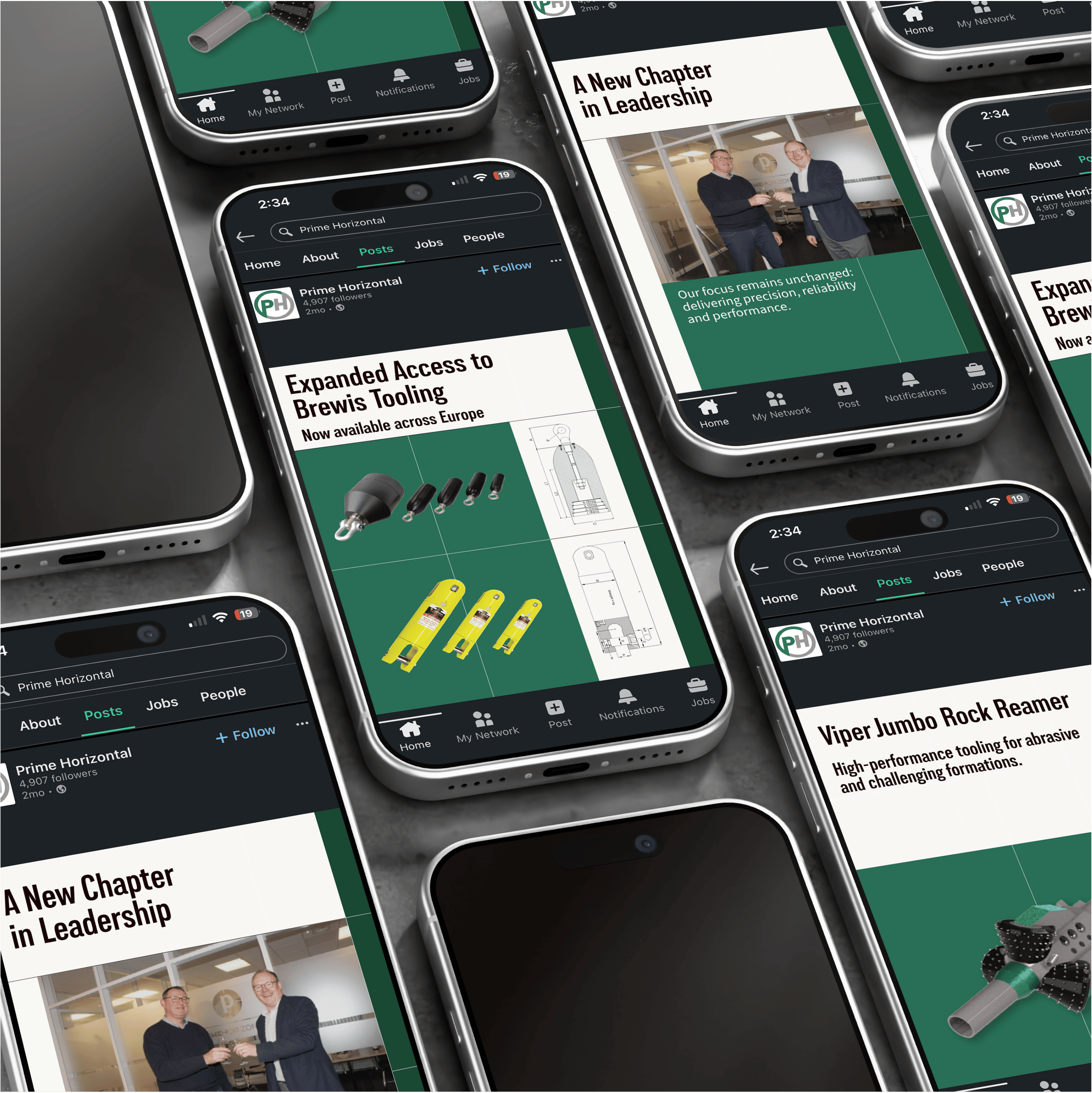
The existing identity had built strong recognition over many years, so the objective was evolution rather than reinvention. The challenge was to modernise the brand while preserving the familiarity that existing clients associated with Prime Horizontal.
The previous icon felt dated, relying on a pseudo-3D treatment that lacked visual balance and became difficult to distinguish at smaller sizes. Rather than replacing the identity entirely, the logo was simplified into a cleaner, more confident mark that better reflects the precision of the business.
The typography remained one of the strongest elements of the original identity and therefore became the foundation of the redesign. The letterforms were refined and reconfigured into a stacked wordmark, creating a more compact and versatile logo that performs consistently across both digital and physical applications.
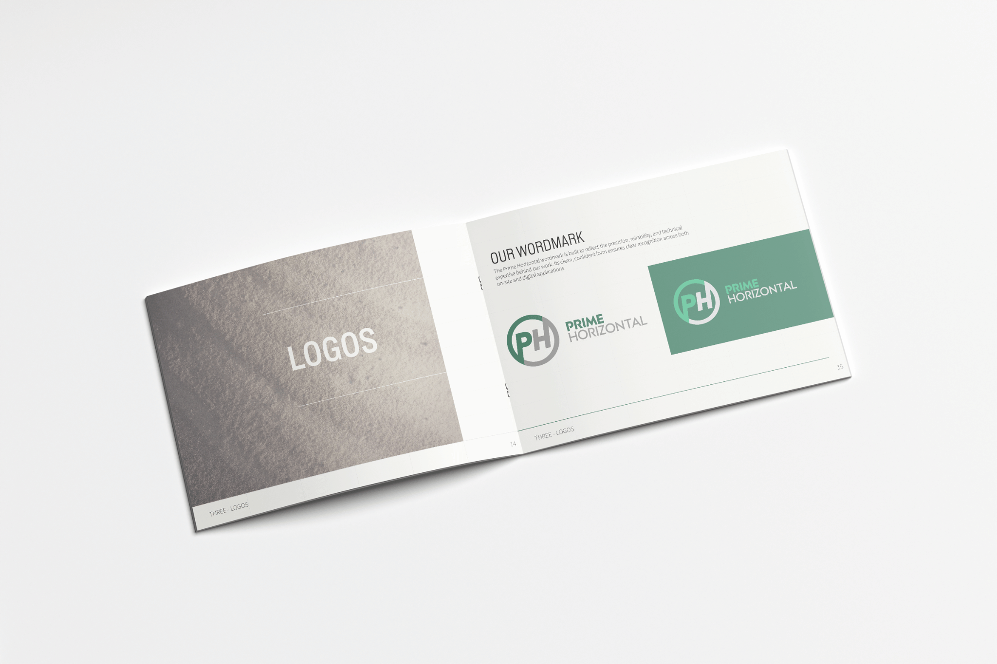


The new icon retains the familiar circular format, reinforcing continuity with the previous identity while introducing a more contemporary form inspired by the geometry of underground pipelines. Together, the icon and wordmark establish a visual identity that feels recognisable to existing customers while presenting the business with greater confidence and clarity.
To maximise flexibility, the identity was developed as a complete logo system, including horizontal and stacked lockups, a simplified favicon for digital environments, and an industrial stencil variant designed for use on equipment and site applications. Dual colourways ensure the identity remains accessible and legible across a wide range of backgrounds and contexts.
With the core identity established, the next stage was to translate it into a flexible design system capable of supporting all marketing activities. Rather than defining individual assets, the objective was to create a visual language that could be applied consistently across every customer touchpoint.
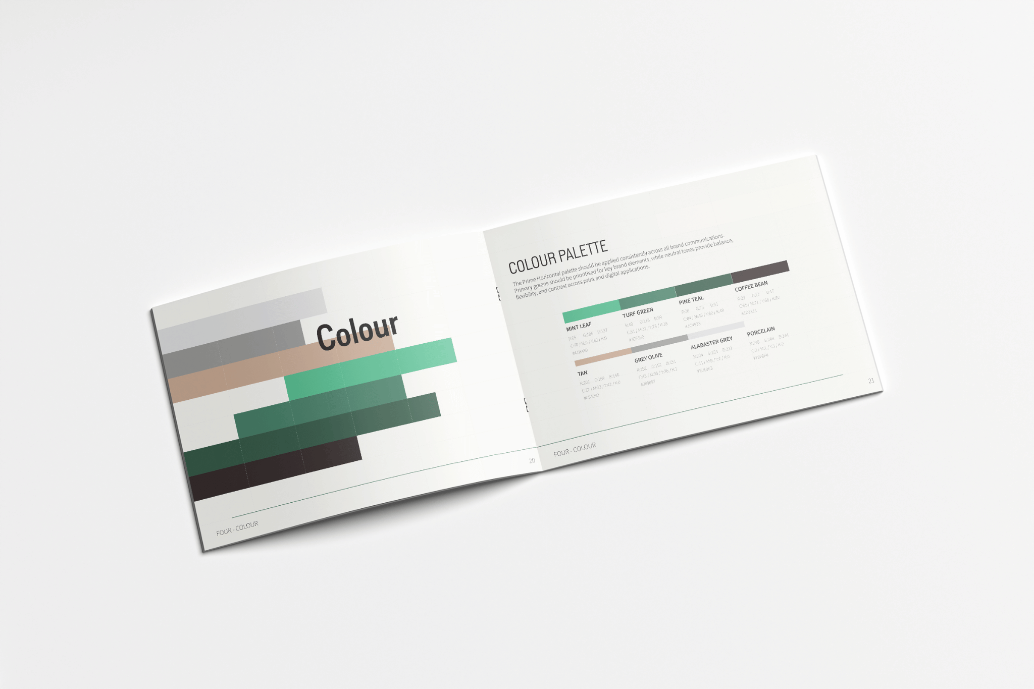
Typography: A clear typographic hierarchy was introduced to balance technical authority with readability. Lorimer No.2 was selected as the display typeface, bringing a bold, industrial character to headlines and key messaging while reflecting the engineering-led nature of the business. Supporting copy utilises Source Sans 3, providing a highly legible and versatile system typeface suited to long-form documentation, presentations and digital interfaces.
Together, the pairing creates a clear hierarchy while remaining practical across a wide range of applications.
Colour: Prime Horizontal’s existing association with green formed an important part of its brand recognition, making preservation rather than replacement the right approach. The palette was expanded around three core greens; Mint Leaf, Turf Green and Pine Teal, each contributing a different level of emphasis and contrast. Supporting earth tones and neutral greys soften the overall palette. The system allows the brand to adapt to different contexts.
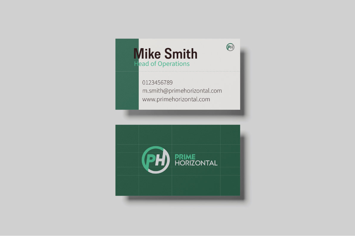
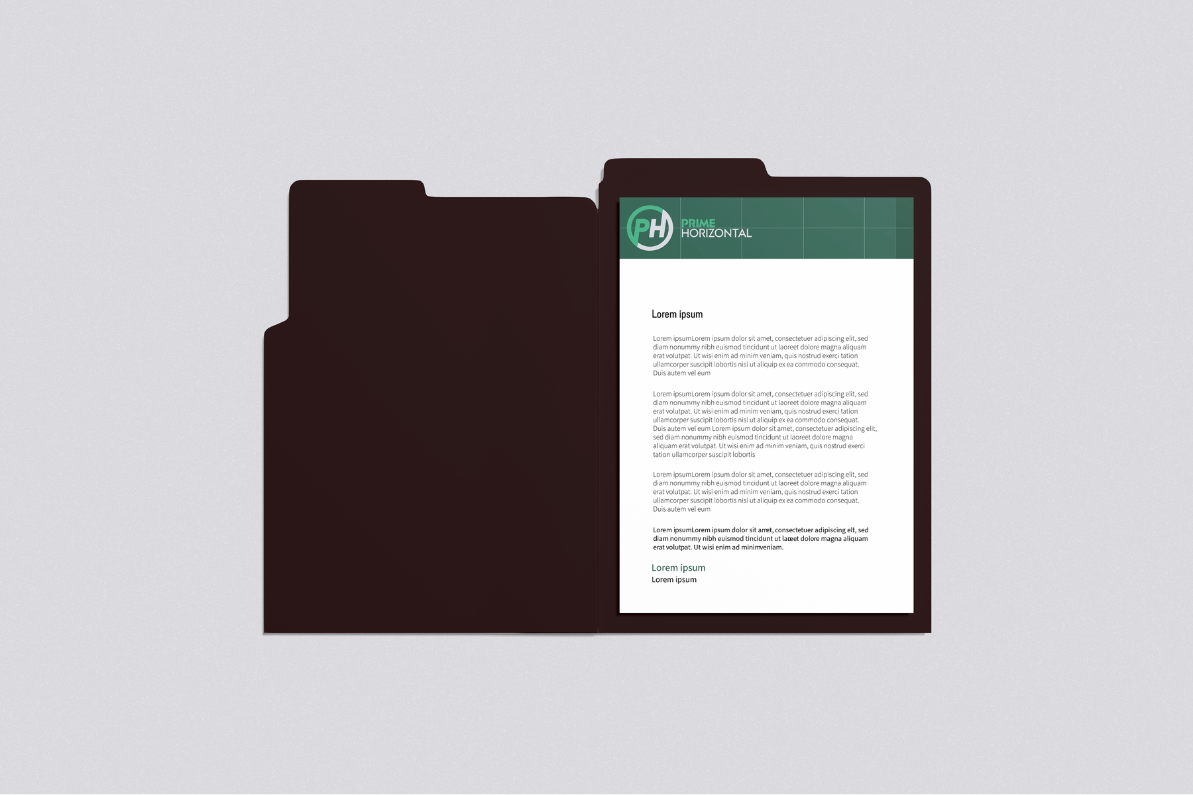
Creative Devices: Beyond colour and typography, a series of creative devices were developed to give the brand a recognisable visual language. Drawing inspiration from engineering disciplines, the system incorporates visible construction grids, technical drawings, tooling renders and engineering overlays to reinforce precision and expertise.
Product isolation allows engineering details to become the focal point, while infrastructure photography demonstrates products within real-world environments, connecting technical capability with practical application. Collectively, these devices create a cohesive aesthetic that reflects the accuracy, discipline and confidence associated with the Prime Horizontal brand.
Imagery: Imagery was curated to prioritise authenticity over visual spectacle. Photography should feel genuine and informative rather than heavily edited or overly stylised, showcasing tooling, engineers, and project sites.
Images are selected to communicate scale, process or technical detail, with overlays and supporting graphics used where appropriate to provide additional context. Rather than acting as decoration, imagery becomes another method of communicating engineering expertise and reinforcing the brand’s precision-led approach.
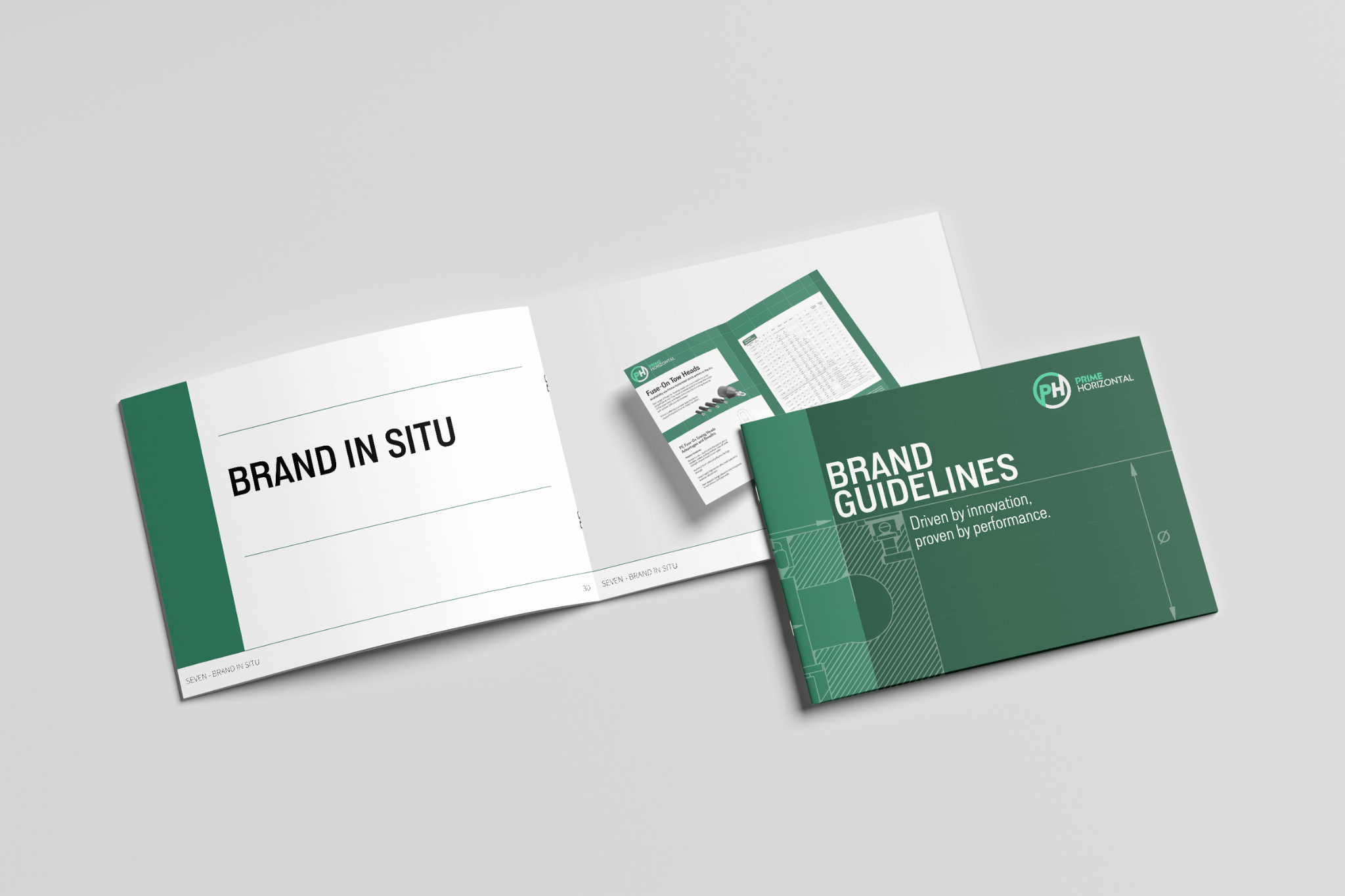
With the visual language established, the website became an opportunity to demonstrate how the identity could extend beyond static brand assets into a functional digital experience. Rather than treating the interface as a separate exercise, the UX was developed directly from the principles established within the wider brand system.
The visible grid introduced throughout the identity became the structural foundation of the interface. A six-column layout provided consistency across the homepage, allowing each content block to align within a clear framework that balances technical precision with readability. This modular approach created flexibility for future page layouts while maintaining a cohesive visual rhythm.
The colour system established within the brand guidelines translated naturally into the digital environment. An off-white foundation keeps the interface clean and approachable, while deeper greens are used to define structure, navigation and key interface elements. Lighter greens and supporting earth tones provide contrast, helping to frame imagery and guide users through the page without overwhelming technical content.
The interface showcases authentic moments from the field-engineers at work, specialist equipment in operation and the underground infrastructure projects that underpin modern life. The photography reinforces the expertise behind the business while illustrating the minimal disruption of the HDD approach.
The homepage was designed to communicate Prime Horizontal’s core proposition immediately, combining clear messaging around global reach, engineering expertise and project confidence with a visual language that feels consistent with the wider identity.

Get in touch to discover how designers can create richer brands that resonate.