


First impressions aren't made in meetings, they're made on your website. So don't let yours blow it.
Every build starts with scoping, not a template. Before anyone touches a wireframe, we map out what the site actually needs to do: who's using it, what they're looking for, and how many pages that genuinely requires.
Skip this step and you end up with a site that's either doing too much or missing something obvious within a month of launch.
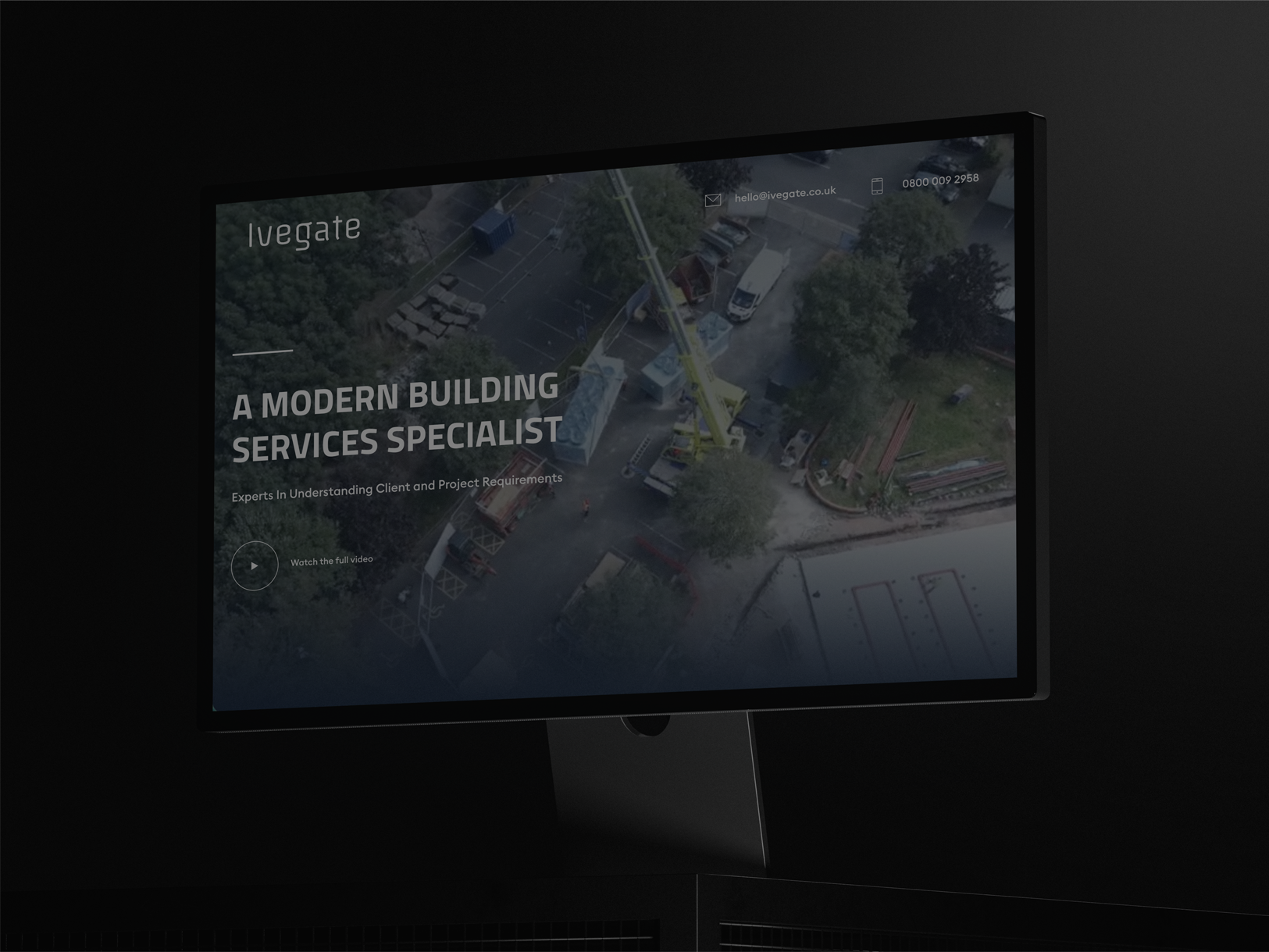
Existing sites get their sitemap audited and rebuilt where it no longer reflects the business, services that don't exist anymore, pages nobody uses.
New sites are built from the ground up, tuned from the start.
Lorem ipsum dolor sit amet, consectetur adipiscing elit, sed do eiusmod tempor incididunt ut labore et dolore magna aliqua. Ut enim ad minim veniam, quis nostrud exercitation ullamco laboris nisi ut aliquip ex ea commodo consequat. Duis aute irure dolor in reprehenderit in voluptate velit esse cillum dolore eu fugiat nulla pariatur.
Block quote
Ordered list
Unordered list
Bold text
Emphasis
Superscript
Subscript
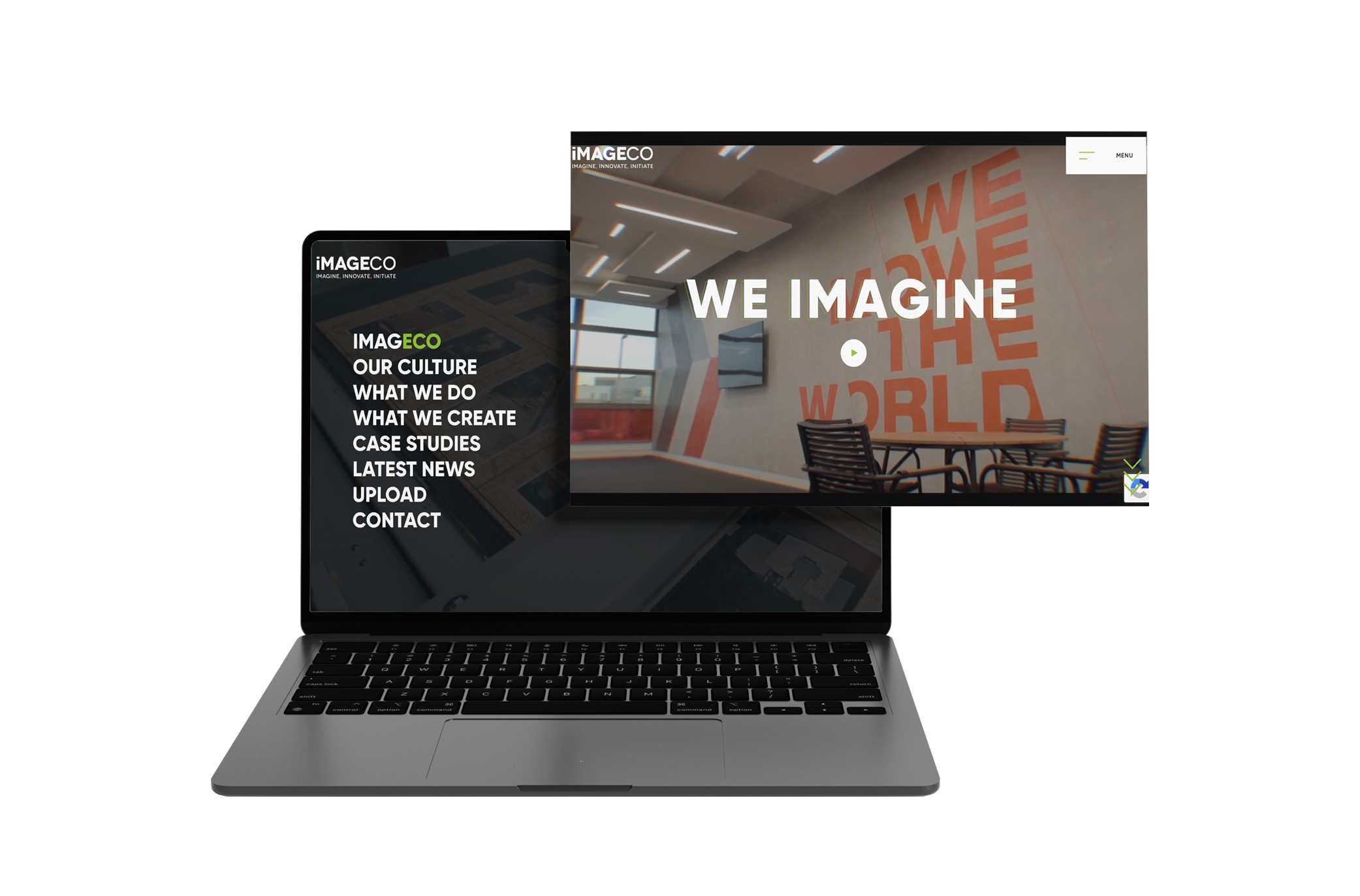


Before we design a single screen, we're also honest about whether the brand itself holds up.
Some businesses need a full refresh, logo, palette, tone, before a website can carry it convincingly.
Others just need the existing brand extended into digital. We assess this at the start, not three weeks into design when it's harder to fix, so design and rebrand aren't happening on shifting ground at the same time.
Lorem ipsum dolor sit amet, consectetur adipiscing elit, sed do eiusmod tempor incididunt ut labore et dolore magna aliqua. Ut enim ad minim veniam, quis nostrud exercitation ullamco laboris nisi ut aliquip ex ea commodo consequat. Duis aute irure dolor in reprehenderit in voluptate velit esse cillum dolore eu fugiat nulla pariatur.
Block quote
Ordered list
Unordered list
Bold text
Emphasis
Superscript
Subscript
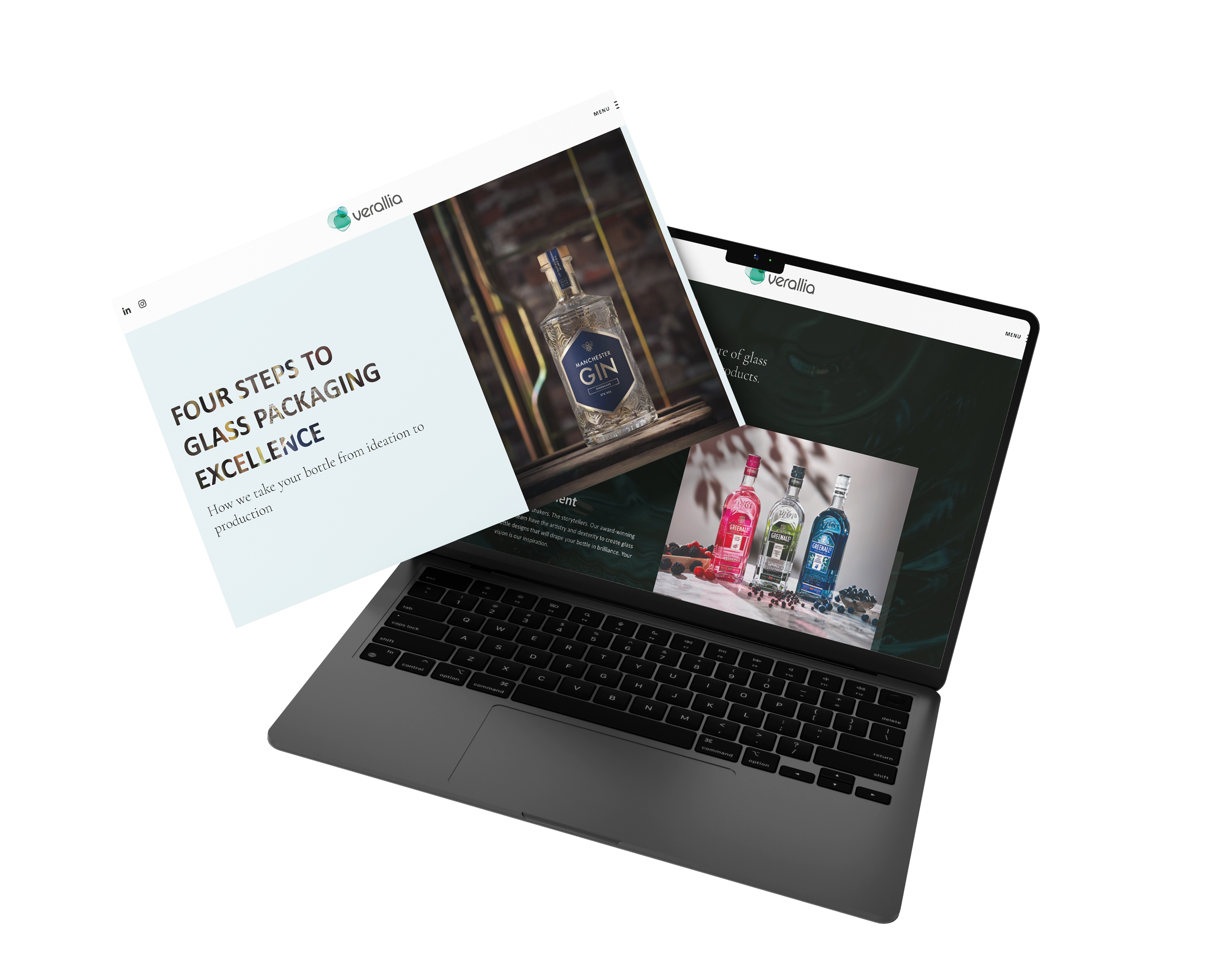
Lorem ipsum dolor sit amet, consectetur adipiscing elit, sed do eiusmod tempor incididunt ut labore et dolore magna aliqua. Ut enim ad minim veniam, quis nostrud exercitation ullamco laboris nisi ut aliquip ex ea commodo consequat. Duis aute irure dolor in reprehenderit in voluptate velit esse cillum dolore eu fugiat nulla pariatur.
Block quote
Ordered list
Unordered list
Bold text
Emphasis
Superscript
Subscript
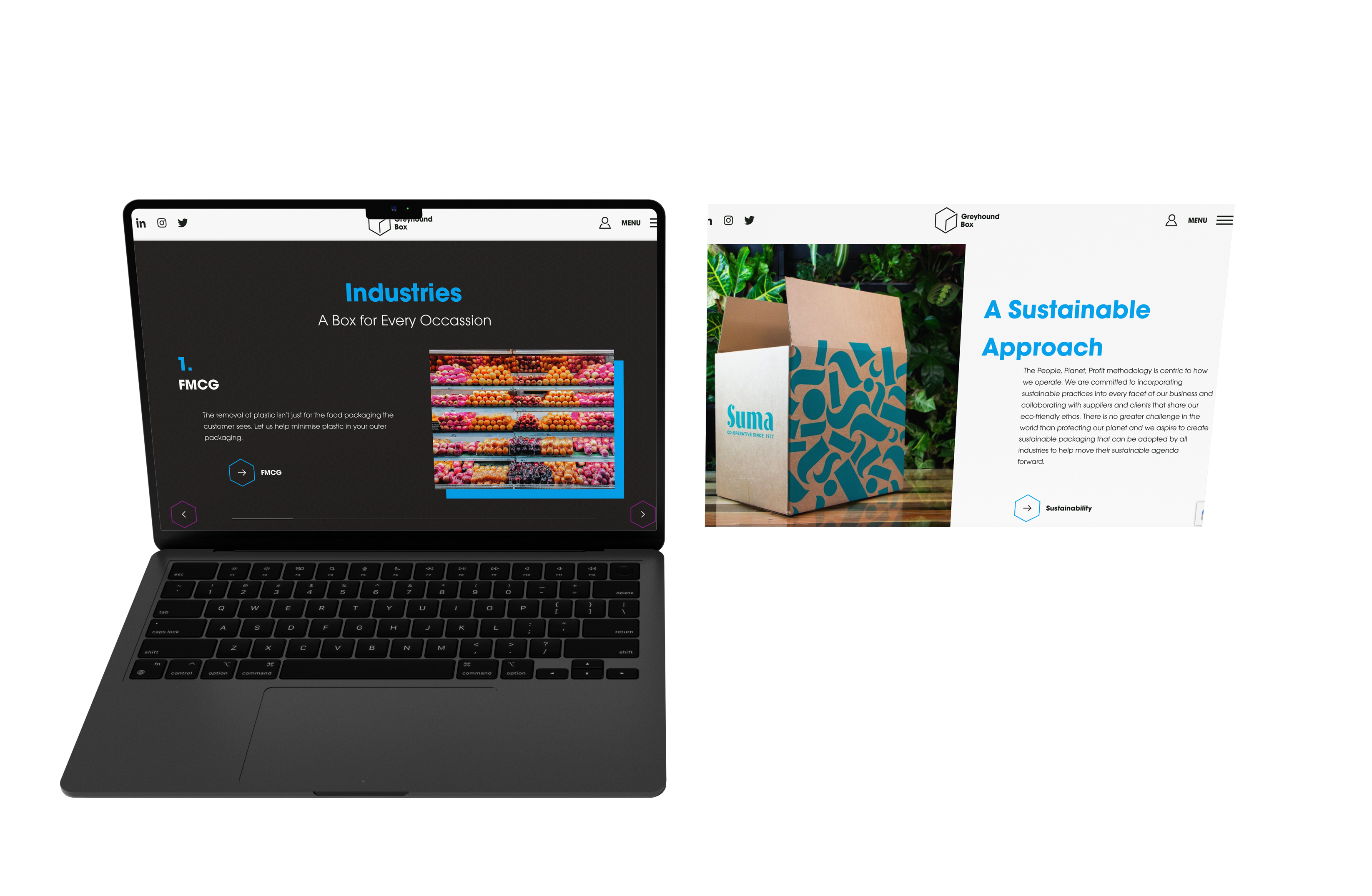


None of this happens in isolation from how people find the site in the first place. Structure, navigation, and internal linking are built with SEO in mind. We also structure content in the design to give clear patterns and relationships for the LLMs that GEO depends on.
A design phase drags when nobody's driving it. You'll have a dedicated account manager who runs from brand discovery through to launch, keeping you updated at every stage. No chasing required.
Every mockup, sitemap, and prototype gets signed off with you before development starts, so what gets built is exactly what you approved. Your account manager stays on it through the build too, keeping design and development aligned right through to launch.
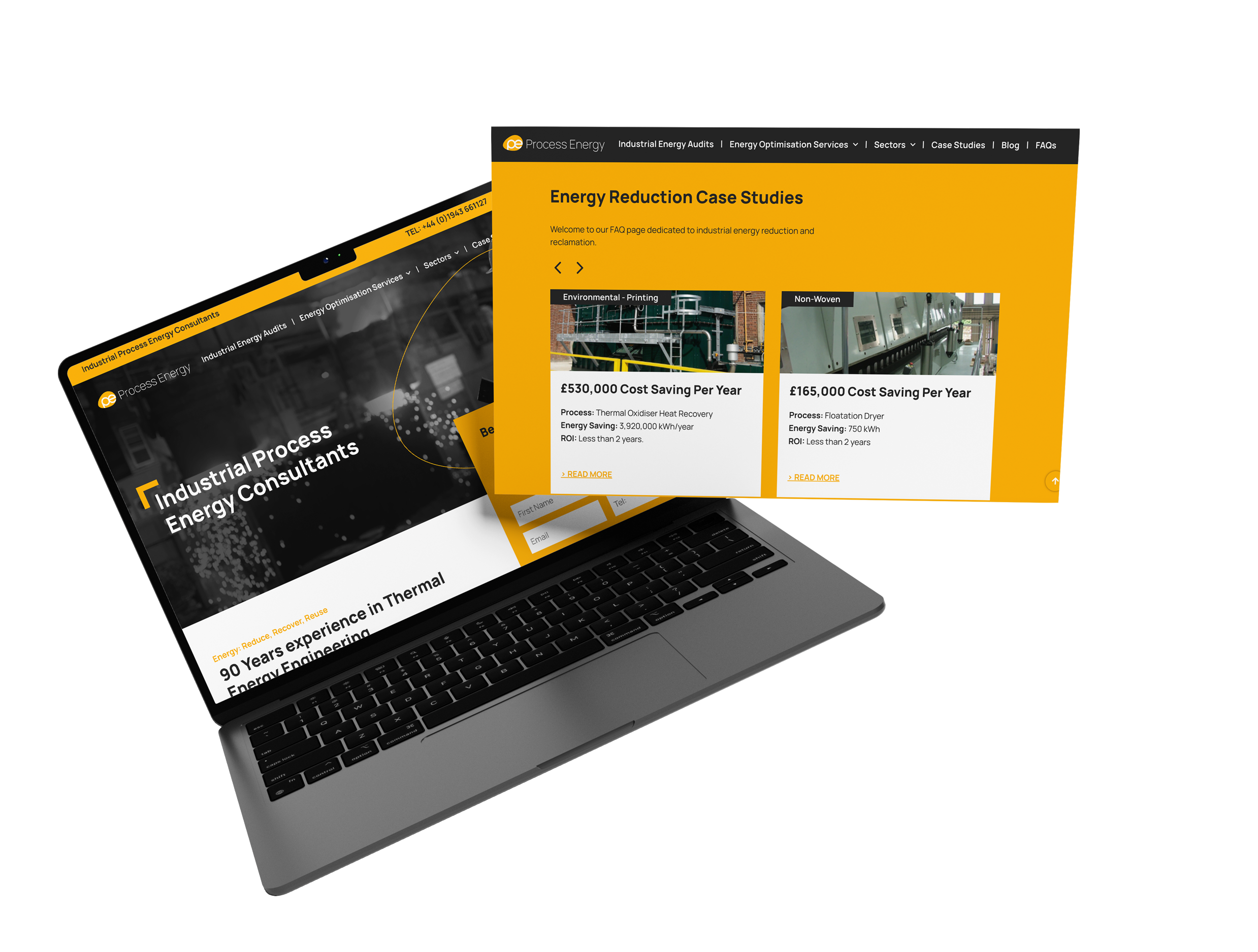



Your site is the home of your business. It's the source of truth for your clients, and it's often the first impression prospects have. We create websites that captivate and communicate your brand at first glance.
Explore the results our team have generated.

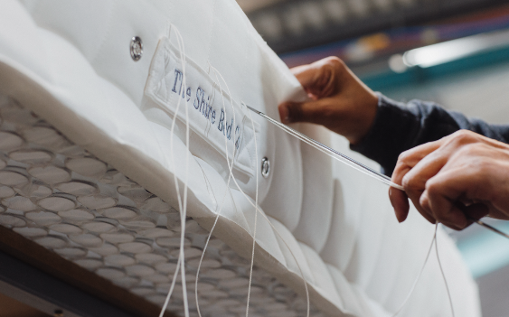

The best UX comes from negative space, clear hierarchy, and clean formatting, not from adding more to the page.
Negative space gives the eye somewhere to rest and signals what actually matters, rather than competing for attention with everything else on the page. Clear hierarchy guides a visitor through in order: the biggest decision first, supporting detail after, so nobody's left guessing what to look at next. Clean formatting, consistent spacing, readable type, layouts that don't shift as someone scrolls, is what makes a site feel finished rather than assembled in a hurry.
Our Shire Beds case study shows this in practice: stripping an overcomplicated design back to something simpler made the site easier to use, not harder to trust.
Got a website that needs the same treatment? Get in touch and we'll take a look.
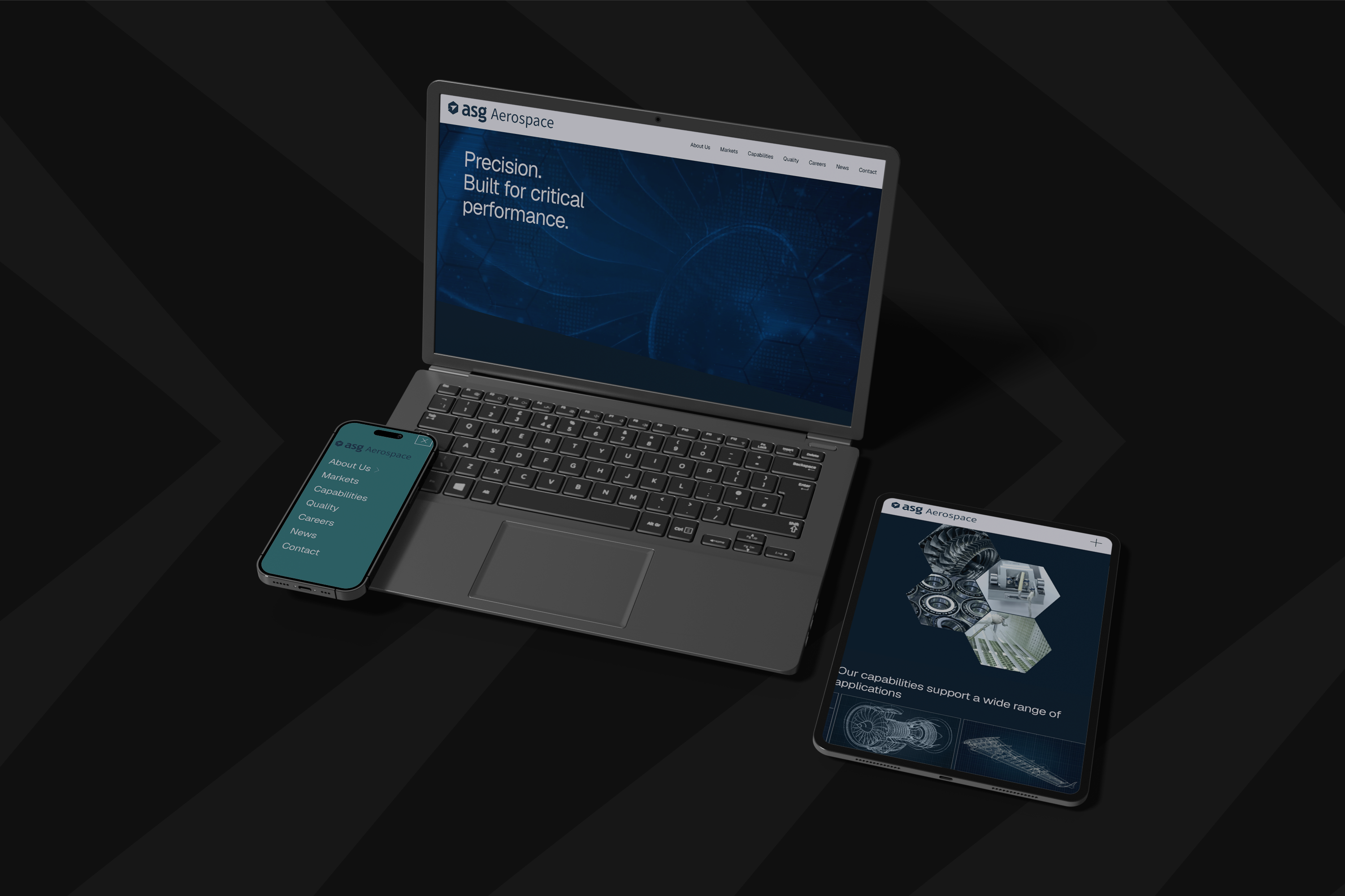
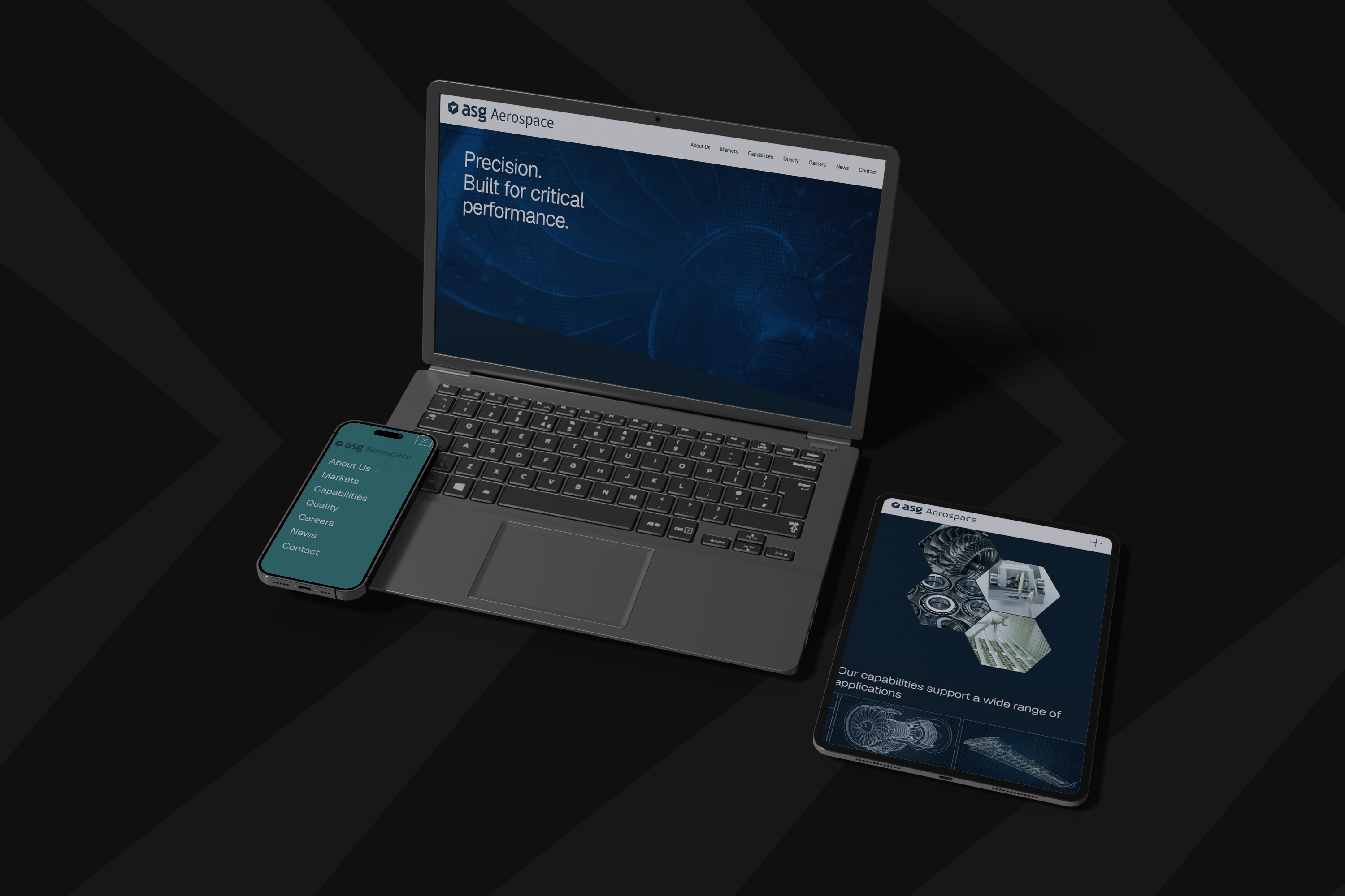
Halston B2B builds responsive websites that perform properly on every screen size, not just look fine on the ones someone happened to test.
We design around key breakpoints and build to scale seamlessly in between, so a visitor gets the same standard of experience whether they land on a phone, a tablet, or a full desktop monitor.
Looking for a responsive site that performs as well as it looks? Talk to Halston B2B.
A modern startup website needs to do more than look good. It needs a clear value proposition, mobile-first responsive design, fast load times, and an intuitive experience that actually gets visitors to take action.
We build using modern low-code platforms like Webflow, backed by GSAP-powered animation, to create sites that feel fast and engaging without compromising performance for the sake of a flashy effect.
For startups, this matters more than most: you don't get a second shot at a first impression with limited runway. Speak to Halston B2B about getting it right the first time.
Modular grids keep layouts consistent across every page, so content lines up predictably and a visitor never has to relearn how to read the site as they move through it. Micro-animations, small transitions on a button, a subtle shift on hover, give feedback that something's responded to an action, without slowing the page down or feeling gimmicky. Accessibility-first design, proper contrast, readable font sizes, sensible tab order, means the site works for everyone landing on it, not just the visitors it was built and tested for.
Our Shire Beds case study is a good example of the modular grid piece specifically: a cleaner grid structure made the site easier to navigate without needing a full redesign around it.
Fancy the same result? Get in touch and we'll take a look.