

The Halston B2B Rebrand - A Labour of Love, Late Nights and Lightning
Ten Years In, We Finally Took Our Own Advice
How Halston B2B rebranded itself for its 10th birthday: the brainstorm, the brand, the build and the big day.
There's an old saying about the cobbler's children having no shoes. In agency land it goes like this: you spend a decade building brands, websites and messaging for everyone else, while your own sits in the corner gathering dust, and you quietly wince at your logo every time you send a proposal.
Guilty as charged. Client work always came first (as it should, they pay the bills) and our own brand got bumped to "next quarter", every single quarter. So as Halston B2B turns ten this year, we gave ourselves a birthday present like no other: a fully-fledged brand and a fresh new site. And we ran it exactly the way we'd run it for any client, because ten years of brand planning means we know the process works. We just had to sit still long enough to do it.
Step one: ask the people who know us best
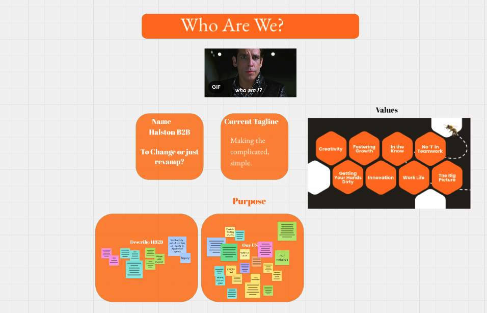
Before anyone opened a design file, we got the whole team together around a very large Miro board to work out who we actually are. Ten years of work had made us into something, and we needed to approach it honestly.
We started with purpose. What came out wasn't a list of services, it was the stuff clients had been telling us for years: we know our stuff, we challenge thinking, we produce work in seriously specialist markets without breaking a sweat, and we'd never run a campaign we didn't believe in or couldn't deliver on. We take companies from start-up to sale.
Then we asked 'who are we for?' The industries board read like a who's who in tech and heavy industry. Established businesses, and the sales and marketing leaders inside them, many of whom have been doing it on their own for far too long. Nothing great is built alone.
Finally, we asked each other frankly, want do we want to achieve? And what makes us proud? Mainly we all agreed it's the feeling we get when clients are genuinely excited about out ideas, and that look of shock and awe that we do understand their niche and technical industry, not only that, we're super interested in it - that one never gets old
Precision Marketing, Propelling Industry
From there we built a new value proposition, a tagline and a full hierarchy of messaging. The tagline had a big job: say how niche our expertise is and who we do it for, in four words. So let's take it apart.
Precision. We don't do generic. Our clients make things that are measured in microns and launched into orbit, and their marketing deserves the same level of accuracy: the right message, to the right buyer, in the right language.
Marketing. Does what it says on the tin. No "solutions", no "synergies".
Propelling. Momentum. Moving our clients forward, into new markets and new pipelines. And yes, it's a nod to propulsion, because when your client list includes aerospace and space tech, you're allowed a rocket pun.
Industry. The sectors we live in, from heavy industry to deep tech. And a lexical hat tip to the meaning of industrious, because we're a hard-working bunch.
All in. All of us. All the time.
The value proposition is how we work, in three short lines. All in means we go above and beyond, every time. All of us means you get the whole boutique team and the economy of scale that comes with a decade of experience. All the time means we're there when you need us, not when it suits us.
Now, the eagle-eyed will notice the A in our new logo is singled out. That's not the font, it's a designed piece in its own right, so the "All" in Halston carries straight into the value prop. It also has an ulterior motive. After ten years, people still say Hal-ston, with a short A like the start of "ballet". It's not. It's Haaall-ston: ball, hall, fall. All in, all of us, all the time, all in Halston. A decade-long pronunciation problem, solved with a logo and a new value prop. (Probably.)
A tone of voice anyone can pick up
Next came tone of voice, and we were ruthless about it. Sliding scales from formal to casual, serious to humorous. A list of what we are (frank, credible, unapologetic, a little bit cocky) and what we are not. "Thrilled" was the first word to be banned, and nobody has missed it.
We wrote "don't say this, say this instead" rules. "We understand complex industries" became "Your industry isn't complex. Your agency doesn't get it" "Let us help your business grow" became "Stop explaining. Start selling."
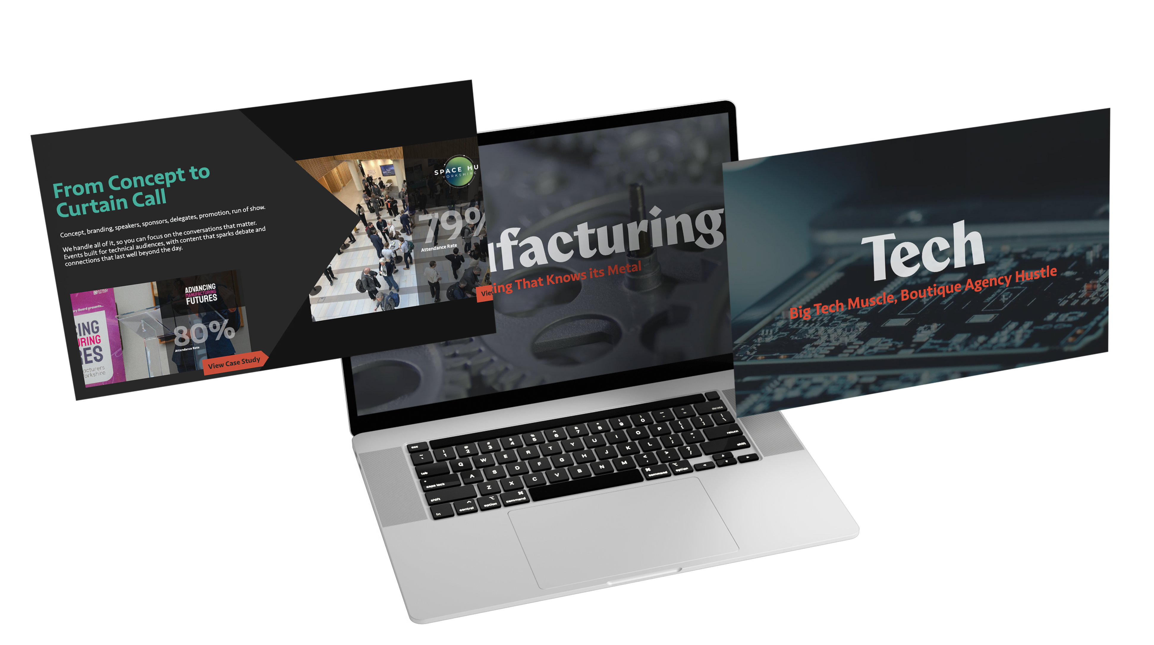
Because the brand book is so prescriptive about what we stand for, anyone in the team can write in our voice and it still sounds like us. That's the real test of a tone of voice, and the proof is all over the new site. A few of my favourites:
Darker, edgier, a bit cooler
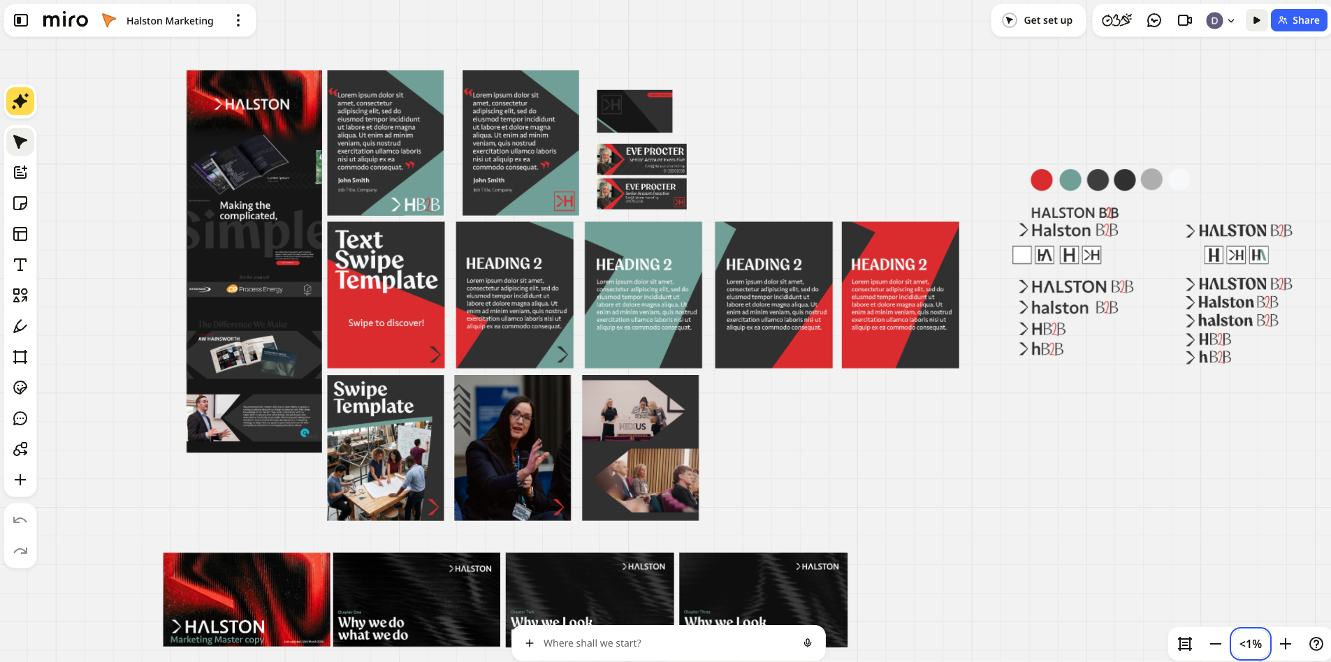
All of the ground work we did to plan the brand, pulling meaning from our experience and sentiment from our serious work became the creative brief, the same way it would for a client. And the brief was clear: move away from the corporate look. Our clients build rockets, run factories and are working on the stuff that'll power the next fifty years. They don't need another agency that looks like a bank.
So we went darker, edgier, cooler: black backgrounds, a bold red that doesn't apologise, and diagonal stripes with a bit of motion in them. We pulled inspiration from well outside the usual agency mood board, then worked through round after round of logo iterations until the A earned its place. Not to mention our favourite creative device 'chevvy' you'll see this cheeky chevron in our logo and throughout or site and creatives!
The build: practising what we preach
If you read my WordPress vs. Webflow blog post, you'll know I promised our old WordPress site wouldn't be around for long. Watch this space, I said. Well, here's the space. The new site is built on Webflow, and nobody has to call a developer to change the footer ever again.
It wasn't only a principle thing. As Saul Hardiman, our creative designer, puts it, Webflow let him build this world without any restraints. Its CMS collections mean he hands the team pre-structured blocks, so we can spin up new pages, blog posts and case studies ourselves without anyone going rogue with the brand. And frankly, after six years of me banging on about no code, low code and vibe coding, launching on anything else would have been remiss of us. We put our money where our mouth is.
The pretty part is only half of it. Ten years builds up a lot of baggage: 67 pages, 37 case studies and 89 blogs, every one of them migrated across. We restructured our URLs to match how the site is actually navigated and mapped redirects so a decade of search equity didn't vanish overnight. Technical SEO isn't glamorous, but get it wrong on a migration and you'll feel it for months.
We also built for how people search now. Buyers are asking ChatGPT, Claude and Google's AI Overviews, not just typing keywords, so the site was planned for AEO, GEO and AIO from day one: schema markup, FAQ blocks that answer real questions, and an llms.txt file that tells AI tools what we're about. (More on that in our SEO for Manufacturing blog.) Future-proofed, rather than rebuilt again in three years.
Lights, camera, slightly awkward smiles
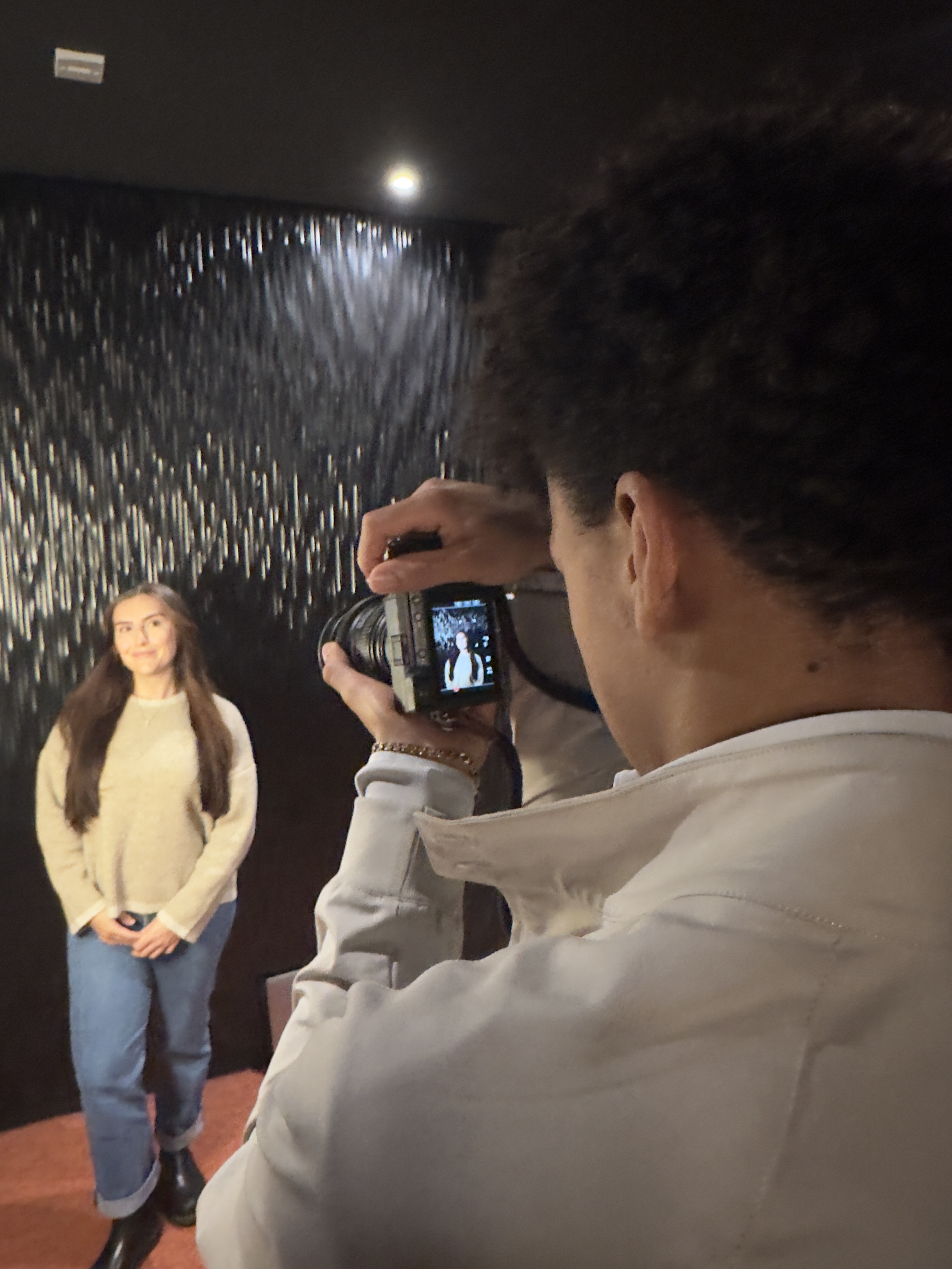
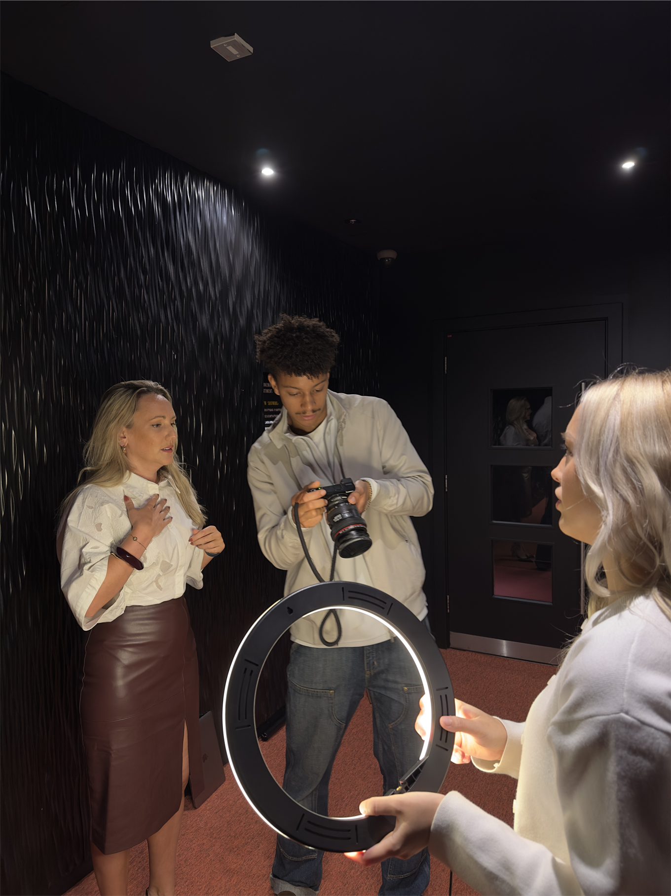
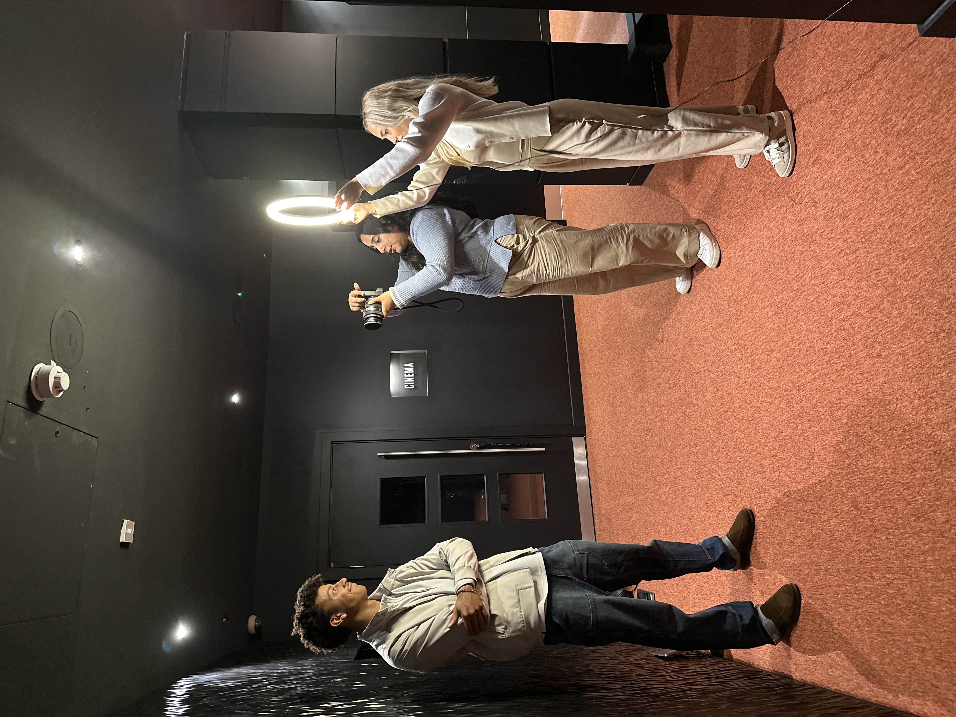
New brand, new faces. We ran an in-house photoshoot for fresh team headshots and a library of brand photography for the site, PR and social for the months ahead. Nobody blinked in every shot. Eventually.
The roll-out nobody warns you about
Here's what clients never quite believe until they've lived it: a rebrand isn't a logo and a website. It's everything. Email footers. LinkedIn headers, for the company and every single one of us. Social media style setters so every post looks like it belongs. New branded pitch decks, proposal templates, the lot. Every small thing that carried the old look had to be found and replaced, and there are always more of them than you think.
Go-live
We went live on Wednesday 28 October, just in time for our tenth birthday on 7 November. The button was pressed, the redirects held, and nothing caught fire. The proper celebration comes later this month at our ten-year birthday party.
Ten years, one brand we're properly proud of, and a website that finally looks like the work we do. All in, all of us, all the time.
If you're reading this, it means you're on the site now! But have a proper look around and let us know what you think. We're a marketing agency, we can take it.
And if your own brand has been sitting on the back burner (no judgement, we've been there), we'd love to take you through the same process. Get in touch and let's get it off the ground!