Neurodivergence & The Importance of Colour Within Design
We are surrounded by a multitude of colours in various forms, and while many of us may not think about it, colour shapes and influences our lives in profound ways. However, the way we perceive, and process colour can vary significantly from person to person, giving everyone a unique perspective on the world. This concept of colour perception has been extensively studied, offering insights into the human experience in this beautifully diverse and colourful world we call home.
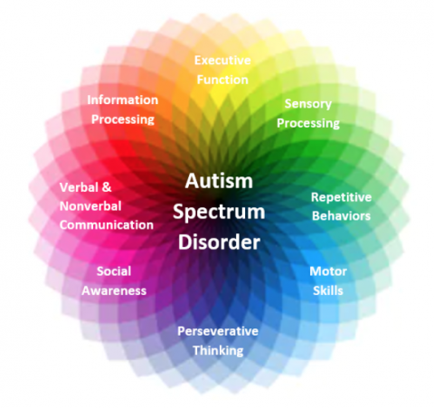
Neurodivergence
Within the realm of cognitive functioning that deviates from the “typical” range, there exists a spectrum of neurodiversity. Conditions such as Autism, Dyslexia, and dyspraxia fall under this umbrella term. Autism, in particular, has gained increased attention in recent years, with research indicating that 1 in 59 children are diagnosed with Autism Spectrum Disorder (ASD). Moreover, it is noteworthy that males are four times more likely to be diagnosed with ASD than females, and in the UK alone, there are over 700,000 individuals on the autistic spectrum.
ASD affects how individuals perceive their environment and interact socially. One significant aspect of this disorder is sensory processing, which includes how a person perceives colour and their surroundings. By exploring how individuals with neurodivergence perceive their environment, we can gain valuable insights into the importance of colour in daily life.
The Importance of Colour in Interior Design
Colour plays a fundamental role in interior design, creating moods, evoking emotions, and shaping the overall ambiance of a space. For individuals with neurodivergence, the impact of colour can be even more significant. Sensory sensitivity is common among individuals on the autistic spectrum, and certain colours can either soothe or agitate their sensory experience.
When designing spaces for individuals with neurodivergence, it is essential to consider their unique needs. Calming colours like soft blues and greens can create a serene and peaceful environment, promoting relaxation and reducing anxiety. Conversely, vibrant, and contrasting colours may be overwhelming for some individuals, leading to sensory overload. By understanding and accommodating these preferences, interior designers can create inclusive and harmonious spaces that cater to a broader range of individuals.
In contrast, interior designers must remember to be mindful of encapsulating most, if not all, possible ways of delivering colour safely and effectively. The neurodiverse spectrum spans from hypersensitivity to hyposensitivity. ‘Hyper’ refers to individuals who prefer spaces with controlled stimuli, disliking environments with excessive stimuli, such as bright lights or textures. ‘Hypo’ refers to individuals who prefer to be overstimulated or need more stimuli to process sensory information.
The Influence of Colour in Graphic Design for Creative Digital Marketing
Colour is a powerful tool in graphic design, and it plays a crucial role in capturing attention, conveying messages, and establishing brand identity. In the realm of creative digital marketing, where visual content dominates, understanding the impact of colour becomes even more critical.
For individuals with neurodivergence, colour can have varying effects on their perception and engagement with digital content. It is essential for graphic designers to consider colour choices carefully, ensuring they are accessible and inclusive. High contrast between text and background colours can aid individuals with visual processing difficulties, making the content easier to read and comprehend. Additionally, designers should be mindful of colour combinations that may cause sensory overload or confusion and opt for more balanced and harmonious palettes. Softer, lighter colours with clear contrast between foreground and background should be implemented to present a clear, distinguishable message for these individuals. Ensuring that the end user has a comfortable experience processing information provided, as well as processing colour and visual structure.
Unlike other areas of research, there is still a lack thereof for neurodivergence and web design. However, when reflecting upon industry standards within the physical environment, an interesting study has been conducted featuring children diagnosed on the neurodivergent spectrum. GA Architects tested a varied colour palette, and the resulting ASD-friendly palette was refined by the participants, as seen in the source below.
The main findings state that subdued colours and grey hues/tones were favoured by these children. As mentioned previously, it is important to remind oneself of the wide spectrum that is neurodivergence. Individuals with hypersensitivity may respond well to this palette; however, those with hyposensitivity may need bolder, brighter tones to catalyse productivity and sensory processing abilities.
By embracing inclusive design principles, graphic designers can create visually appealing and engaging content that resonates with a broader audience. Accessibility should be at the forefront of design decisions, allowing individuals with neurodivergence to fully engage with digital marketing materials and fostering a sense of inclusivity.
As a digital creative, I always strive to improve my knowledge and understanding of industry standards. It would be greatly appreciated if you could fill in the survey here.